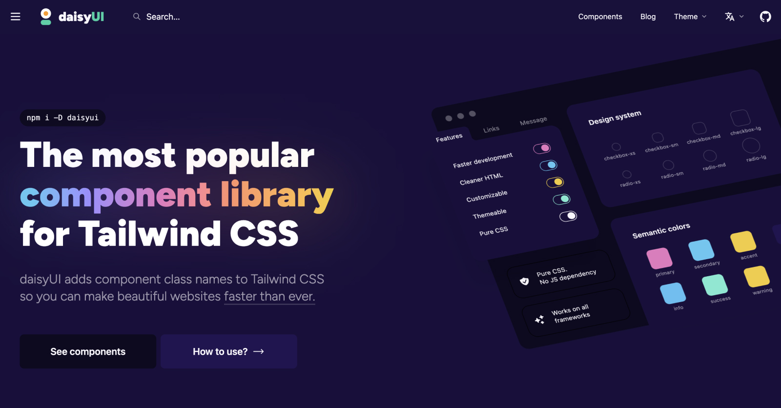
DaisyUI: Effortless and Beautiful Web Interfaces in Tailwind CSS

In the world of web development, Tailwind CSS has really changed the game. It gives developers a lot of control and makes it easier to design websites. But even with all its great features, I was looking for something extra – something to make my projects look better and be simpler to work on. That's when I found DaisyUI, a plugin that really changed how I build web interfaces.
I really put DaisyUI to the test on my latest project. I'm always on the lookout for tools that make things easier without losing any style, and DaisyUI seemed like it would do just that. When I used it with Tailwind CSS, I saw how it made designing smoother and my websites more attractive.
In this article, I'm going to share what I learned about DaisyUI: what it is, how it fits perfectly with Tailwind CSS, and why you might want to use it in your web development projects.
What is DaisyUI?
DaisyUI is this cool plugin for Tailwind CSS that changes the game in creating user interfaces. Tailwind is all about being utility-first, but DaisyUI adds to this by giving you a bunch of pre-made components and themes. This means you get the customization Tailwind is known for, plus the ease of using designs that are already made...
And the great thing is, DaisyUI sticks to Tailwind’s idea of keeping things minimal, so you get a good mix of structure and freedom to be creative. It's versatile – good for small personal stuff or big projects – and it makes things look good and work well.
In short, DaisyUI bridges the gap between utility and beauty in web design. It makes developing good-looking user interfaces easier for developers of all skill levels.
Comparing Styling: Tailwind CSS vs. DaisyUI
Let’s take a look at how styling a basic button is different in Tailwind CSS and DaisyUI.
Tailwind CSS Button:
With Tailwind, you use a bunch of utility classes to get the look you want – things like background color, padding, and text format. Here’s an example:
// Styling a simple button

<button class="bg-indigo-600 px-4 py-3 text-center text-sm font-semibold inline-block text-white cursor-pointer uppercase transition duration-200 ease-in-out rounded-md hover:bg-indigo-700 focus-visible:outline-none focus-visible:ring-2 focus-visible:ring-indigo-600 focus-visible:ring-offset-2 active:scale-95">
  Tailwind Button
</button>
DaisyUI Button:
But with DaisyUI, it’s way easier:
// Styling a simple button

<button class="btn btn-primary">
  daisyUI Button
</button>
In DaisyUI, you just need a couple of classes. 'btn' sets up the basic button style, and 'btn-primary' adds the primary color theme. It’s cleaner, easier to read, and speeds up your work.
What I Liked
One of my favorite features were the ease of switching themes. With just a few tweaks, I could completely transform the look and feel of a website. This flexibility is invaluable, especially when working on projects that require a distinct visual style or when I want to experiment with different aesthetics.
Another aspect I love is how easy it is to customize the components. DaisyUI doesn't lock you into a specific design, allowing for a lot of creativity. Whether it's adjusting the color scheme or tweaking the layout, the process is straightforward and user-friendly. It's these features that really make this library stand out for me, providing a perfect blend of predefined styles and personal customization options.
Open Source & New Release
It’s also open source, which means anyone can help make it better.
DaisyUI just released version 4.0, with cool new components like 'Timeline' and 'Diff'. These components should add even more options for making your web interfaces stand out.
For installation instructions visit the DaisyUI website. Dive in and explore the new features and improvements; who knows, you might just find the perfect component for your next big project!
Have you had a chance to work with DaisyUI? I'd love to hear about it! Drop a comment below.
Junior Full Stack Developer, I juggle code and caffeine with equal enthusiasm. I'm on a quest to turn coffee into user-friendly web apps, one line of code at a time.🚀💻☕
Loading discussion...
Hey! 👋
Got something to say?
or to leave a comment.