 Niall Maher3 min read
How to Use Tailwind CSS Line Clamp - Limit Line Count
Tailwind CSS Line Clamp is a handy feature that lets you control the number of lines shown in a text block.
It's great for making sure text doesn't overflow and look messy.
For example, if you have a long paragraph but only want to show three lines, Line Clamp can do that. The rest of the text gets cut off and usually ends with an ellipsis (...), which shows there's more text that's not being displayed.
How to Use Line Clamp
Using Line Clamp in Tailwind CSS is straightforward. You add a class to your HTML element. For example, line-clamp-3 would limit the text to three lines. Here's a simple example:
<p class="line-clamp-3">
  This long paragraph will only show three lines of text in the browser. I'm adding more text here to make it really, really, really long. Well, I guess it's not that long. But nearly above average.
</p>
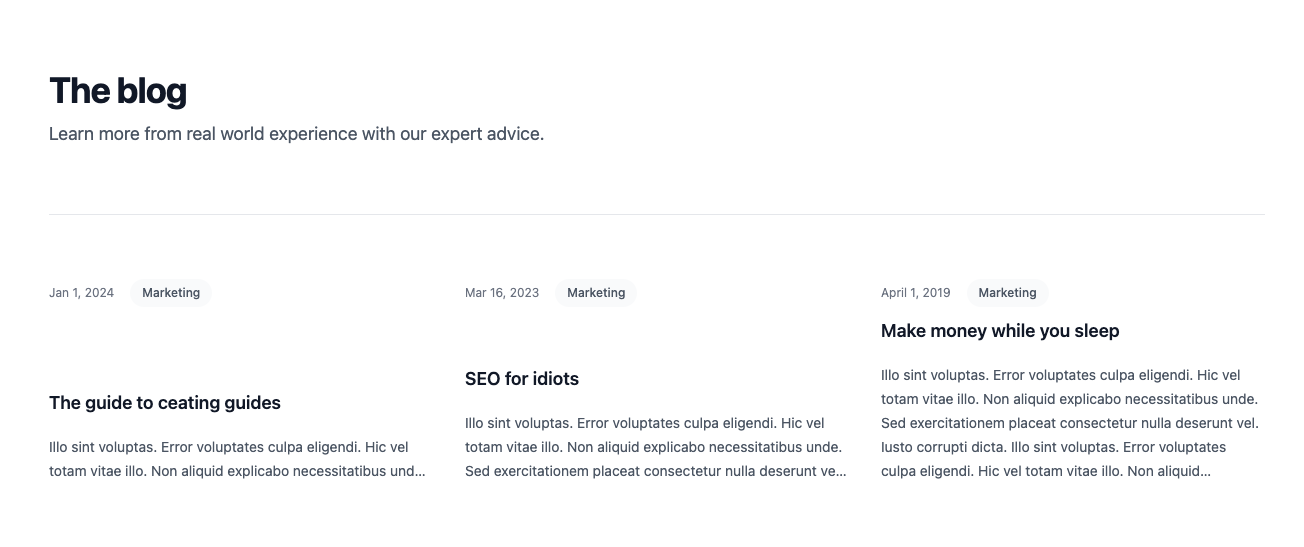
To see it in action, here's a screenshot of a little blog section with different Line Clamps (2, 3, and 5):

Making Line Clamp Responsive
Making Line Clamp responsive means it changes based on the screen size. For example, you might want to show more lines on a larger screen and fewer on a smaller screen.
To do this, you use Tailwind's responsive prefixes.
To do this, you use Tailwind's responsive prefixes. These are added before the Line Clamp class. For example, md:line-clamp-4 would apply a four-line clamp on medium-sized screens and larger.
Here's how you can make a text block show two lines on small screens, three lines on medium screens, and four lines on large screens:
<p class="line-clamp-2 md:line-clamp-3 lg:line-clamp-4">
  This long paragraph will only show three lines of text in the browser. I'm adding more text here to make it really, really, really long. Well, I guess it's not that long. But nearly above average.
</p>
In this example, the default is two lines (line-clamp-2). On medium-sized screens (md:), it changes to three lines; on large screens (lg:), it shows four lines.
Arbitrary values
Tailwind gives you the ability to add line clamps from 1 - 6.
If you need something different, you can use arbitrary values in a typical tailwind fashion:
<p class="line-clamp-[9]">
  This long paragraph will only show three lines of text in the browser. I'm adding more text here to make it really, really, really long. Well, I guess it's not that long. But nearly above average. I will repeat it a few times since I now allow nine lines. This long paragraph will only show three lines of text in the browser. I'm adding more text here to make it really, really, really long. Well, I guess it's not that long. But nearly above average. I will repeat it a few times since I now allow nine lines. This long paragraph will only show three lines of text in the browser. I'm adding more text here to make it really, really, really long. Well, I guess it's not that long. But nearly above average. I will repeat it a few times since I now allow nine lines.
</p>
In this example, it will limit things to nine lines.
And just like that, with just a few classes, you can control exactly how your text appears, no matter the screen size.
Happy coding! ✌️

Founder of Codú - The web developer community! I've worked in nearly every corner of technology businesses: Lead Developer, Software Architect, Product Manager, CTO, and now happily a Founder.
Loading discussion...
Hey! 👋
Got something to say?
or to leave a comment.