 Niall Maher3 min read
The Box Model and Display
The Display property and the Box Model are two essential concepts for understanding how elements are shown on a webpage. Let's see why:
What is the Box Model?
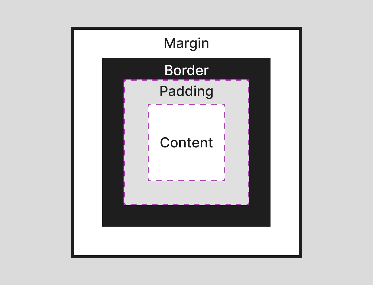
The CSS Box Model describes the rectangular boxes generated for elements in the browser. It's one of the foundational concepts in CSS that can confuse many people if not understood, so it's worth spending time on it.
In short, it explains how the height, width, padding, border, and margin affect their size and position.
Each element in CSS is represented as a "box" with the following components:
- Content: The innermost part where text and images appear.
- Padding: The space between the content and the border.
- Border: A line surrounding the padding (and content).
- Margin: The outermost space, providing space between the border and other elements.
To visualize this, here's an image:
By default, if you set the height and width of an element to say something like 200px, you might expect the element to be 200px height and width. Unfortunately, it's not the case.
By default, the height and width don't include the size of the padding and border because of the box-sizing property.
By default, it is set to content-box. But by updating this to border-box, these values are taken into account, which I usually prefer as it's easier to do maths on.
Here's an example of an element with a height and width of 240px and then a padding of 20px and a border of 10px:
Toggle the box-sizing to see the size change:
A handy "hack" for your toolbox if you always want the border-box behavior is using the global selector:
* {
  box-sizing: border-box;
}
I usually add this to my styles before I start any project.
The Display Property
The display property determines how an element is displayed on the webpage. Each HTML element has a default display value. Understanding and manipulating the display property is key to controlling the layout.
Display Values
block: Takes up the entire width and starts on a new line. Examples includedivandp.inline: Takes up only as much width as necessary and can sit alongside other elements. Examples includespananda. You can think of it as something that doesn't break the flow of the layout.inline-block: Similar toinline, but allows width and height to be set.flexandinline-flex: This provides flexible box layouts for complex designs. Later sections will discuss this.gridandinline-grid: Provides grid layouts for advanced designs. Again, we will cover this in detail later with an entire section.table: Makes the element behave like a table. Generally, use the<table>tag for table layouts. I've never encountered a use case for thisdisplaymode, but for completeness, I thought you should know about it.
Here's some elements to play around with to help your understanding:
Recap/Notes
- Block elements: You have full control over width, height, padding, and margins.
- Inline elements: You cannot set width, height, padding, or margins.
- Inline-block elements: Allows control over width, height, padding, and margins while being inline.
- Box-sizing: Affects the size of elements if they have
borderandpaddingapplied.
By understanding these foundational concepts, you can effectively control element sizing, spacing, and layouts, which will become vital as we move on to layouts and build more complex pages in the following sections.
Founder of Codú - The web developer community! I've worked in nearly every corner of technology businesses: Lead Developer, Software Architect, Product Manager, CTO, and now happily a Founder.
Discussion 0
Got something to say?
or to join the conversation.