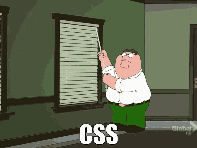
Win the battle against CSS
Last week, I found myself engaged in more hacking, which, for the most part, was a calm and engaging experience. However, I couldn't help but notice some newer team members struggling and becoming frustrated with CSS. It brought back memories of my own struggles: countless hours spent grappling with breakpoints, befuddled by unknown margins, and feeling like I was back in geometry class by grid template layouts. What in the world was a float?
Why do you suppose there is such a plethora of CSS libraries, template packages, and UI libraries?
It's all in an effort to reduce the burden of CSS design, so we can concentrate more on functionality and logic. I remember spending 75% of my time wrestling with text overlays, and only 25% for actual logic. Madness!
While these challenges were essential for my growth, I feel for those currently facing them. It can be disheartening to be stumped by something that appears so straightforward. Let me assure you, it's anything but simple, especially in the beginning. So, no need to worry.
Nevertheless, while I advocate for delving into the trenches and grasping the fundamentals of flexbox, grid layouts, and absolute positioning, I'll also share a few tips and tools that have helped me navigate this endless battle a bit more smoothly.
1. Responsive Text
Ok, this simple function will save you from creating a multitude of breakpoint media queries.
font-size: clamp(1rem, 2.5vw, 2rem);
It essentially sets a preferred font size with max and min properties. A life saver.
2. What is this spacing!?
Sometimes you might think, 'Why the hell is there random spacing?' There is default spacing to elements, so it's best to remove it early to give yourself full control.
*,
*::before,
*::after {
  padding: 0;
  margin: 0;
}
Those * selectors will select all elements and remove any default margin
3. Find, locate, and neutralise that spacing error.
At other times, you might be using a library like Bootstrap, which will have its own spacing properties, and it might be really hard to see where elements end and why layouts are shifting on mobile.
While you could use outline: 1px blue on all elements, I recently found this package called Pesticide for Chrome, which will do it for you in a more elegant way.

Pesticide is a perfect name!
4. Learn CSS layouts
Drop all else!
It doesn't matter if you are in the camp of flex or grid; learn one and stick to it. Layouts will become much simpler. I can't describe how much a simple CSS snippet like this has saved my life.
Run and hide from floats.
.container {
  max-width: 1200px;
  display: flex;
  justify-content: center;
  align-items: center;
}
5. Contained Images
If you want an image to resize responsively within its container but maintain a certain aspect ratio, just use the aspect-ratio property with a width set to 100%..
video {
  aspect-ratio: 16/ 9;
  width: 100%;
}

img {
  aspect-ratio: 1/1;
  width: 100%;
  max-width: 400px;
}
6. Position absolute centre
This takes the element out of the flow and creates a stacking context. Make sure the desired parent element is positioned relatively.
.parent{
  position: relative;
}
.child{
  position: absolute;
  top: 50%;
  left: 50%;
  transform: translate(-50%, -50%);
}
7. Background Image
You want to overlay text over an image? You can use the method above to achieve the desired result, or you can use a background image.
Set these properties to create an image container in which you can place content. I added a slightly opaque linear gradient to the background so the text will pop out more.
The url selects the image and the gradient adds a slight darkening.
.container {
  text-align: center;
  background-image: linear-gradient(rgba(0, 0, 0, 0.4), rgba(0, 0, 0, 0.6)),
    url("./autumn-trees.jpg");
  background-position: center;
  background-size: cover;
  height: 50vh;
  width: 100%;
}
8. Avoid fixed height property
Generally speaking, you want to avoid setting a specific height for any layout element (i.e., 100px).
Try using the min-height property instead, paired with flexible units of measurement such as vh, dvh, svh.
9. Root variables
Nothing worse than a late design choice change where you will need to update colours, spacing, etc. Make it easier on yourself with CSS variables
:root {
  --primary-orange: #ff451e;
  --primary-amber: #ffc107;
  --primary-green: #4caf50;
  --primary-cyan: #00bcd4;
  --box-shadow: rgba(99, 99, 99, 0.2) 0px 2px 8px 0px;
}
Once declared in the root you can assign these theme colours to elements.
.widget-list-inline li a {
  border: 1px solid var(--primary-orange);
}
You can add whatever you want here, consistent padding, gradients etc. Now whenever you need to chance its only in one place.
10. Border box
Nobody likes unintentional mathematics, right? The default box model is set to content-box. This means that the width and height of an element are calculated based on the content inside the element and after padding and margin are then added to it.
Let's say you have a width of 300px, padding of 10px, and margin of 10px; the total width would now be 340px. Not something you expected, right, as you explicitly set it to 300?
Simple add
*,
*::before,
*::after {
  box-sizing: border-box;
}
Now the element will be sized based on its border and not content.
Honestly, there is so much to learn about CSS, but I hope these few tricks will help people with responsive design, padding errors, and common image issues.
If you want more tips and tricks, I have a ton. We didn't touch on pseudo-classes, selectors, value functions. Perhaps another day.
